Build a Future-Proof Custom SEO Dashboard
Most advice about a custom seo dashboard starts in the wrong place. It starts with connectors, templates, and chart types.
That's backward.
A dashboard doesn't fail because Looker Studio, Power BI, or Tableau lacks features. It fails because the team dumps every available metric into one screen, calls it visibility, and then wonders why nobody uses it after the first month. The modern problem is bigger now because SEO performance no longer lives only inside Google Search Console, GA4, and backlink tools. If your reporting view stops at SERPs, you're missing part of the search environment your brand already shows up in.
A useful custom seo dashboard should do one job well. It should help people decide what to do next. That means fewer vanity metrics, tighter KPI definitions, clear drill-down paths, and a dedicated view of AI search visibility alongside traditional organic performance.
Defining Your North Star Metrics and KPIs
Teams usually overbuild before they define what success means. That creates dashboards that look polished but don't change behavior.
The better approach is to work backward from business outcomes. If the company cares about pipeline, your dashboard should ladder SEO inputs toward lead quality and conversion signals. If the company cares about brand discovery, your dashboard should show where visibility is improving, where it is slipping, and which topics drive that movement. If the company runs ecommerce, the dashboard has to connect discoverability to product-page engagement and revenue outcomes, not just rankings.

Start with the KPI ladder
The most effective dashboards reflect a KPI ladder. At the bottom are operational signals such as crawl health, indexation, ranking movement, and content coverage. In the middle are user outcomes like organic sessions, landing-page engagement, and assisted conversions. At the top are business outcomes such as qualified leads, revenue contribution, or branded demand.
That ladder matters because metrics don't all carry the same weight.
A ranking gain is a leading indicator. A conversion is a lagging indicator. A backlink count, by itself, is context. Organic revenue is an outcome. If you mix all of these without hierarchy, the dashboard turns into a scoreboard with no story.
Keep the metric set small
One of the most useful benchmarks in dashboard design is simple. Research indicates that dashboards displaying fewer than 12 primary metrics drive 3x more optimization actions compared to those displaying 30+ metrics, according to Improvado's SEO dashboard analysis. That matches what works in practice. Teams act when the signal is obvious. They stall when they need to interpret a crowded control panel.
A strong executive view often needs only a handful of top-line signals:
- Organic visibility outcome like clicks, sessions, or search-driven conversions
- Technical health signal such as index coverage or critical error trends
- Content performance indicator tied to top landing pages or query groups
- Authority or off-page trend from backlinks or referring domains
- AI search panel showing whether the brand is present, cited, and framed well in LLM responses
Practical rule: If a stakeholder can't explain why a metric is on the dashboard, remove it or move it into a drill-down tab.
Build balanced scorecards, not vanity boards
A custom seo dashboard should balance four views:
| Dashboard lens | What belongs there | What usually doesn't |
|---|---|---|
| Business outcomes | Conversions, revenue contribution, qualified leads | Raw keyword counts with no context |
| Search demand and visibility | Queries, impressions, CTR, ranking distribution | Every tracked keyword in one table |
| Technical foundation | Indexing, crawl errors, Core Web Vitals status | Low-priority warnings with no impact path |
| AI search presence | Visibility rate, sentiment, source attribution, competitor presence | Generic AI commentary with no measurable KPI |
Many teams fail at this stage. They treat AI as a side experiment instead of a reporting category. A complete view now needs both traditional search metrics and AI-facing metrics. If you need a framing for classic search visibility measures before building that scorecard, this guide on SEO visibility search metrics is a useful reference point.
For teams refining KPI choices, it also helps to revisit a smaller set of simple marketing metrics to track so the dashboard stays tied to decisions instead of becoming a warehouse of numbers.
What works and what doesn't
What works is choosing metrics that trigger action. For example, a high-impression query group with weak CTR creates a content and SERP improvement queue. A page group with strong rankings but weak engagement points to mismatch or UX friction. An AI panel showing poor brand sentiment or weak source representation points to content, PR, and authority gaps.
What doesn't work is stuffing in everything available because the connector makes it easy. Domain-level summaries without segment views. Traffic charts without landing-page intent. Backlink totals without quality context. AI mentions without source attribution.
The dashboard should answer one hard question every week. What changed, why did it change, and what should the team do next?
Connecting Your Universe of Data Sources
A custom seo dashboard is only as good as the data model behind it. Digital marketing departments frequently connect the obvious sources, then stop too early.
The standard stack still matters. You need search performance, user behavior, and off-page context. But that stack is incomplete if it ignores the places where buyers now discover brands through AI-generated answers, summaries, and recommendations.
The traditional stack still earns its place
Google Search Console remains the cleanest source for query-level performance, page-level search visibility, and indexing clues. It tells you what Google exposed and what users clicked. That's your starting point for impressions, CTR, average position, page clusters, and indexing anomalies.
GA4 picks up where Search Console stops. It shows what happened after the click. That includes landing-page engagement, conversion paths, event completions, and channel-level business impact. It won't answer every SEO question cleanly, but it's the best place to connect organic acquisition with downstream outcomes.
Ahrefs and SEMrush add competitive context. They help with backlink growth, keyword gap work, SERP overlap, and off-page trends. They're especially useful when the internal team needs one place to compare domain-level movement against market competitors.
If you work heavily inside analytics workflows, a practical resource like Google analytics mcp can help teams think more clearly about how analytics data gets accessed and operationalized across systems.
Traditional data sources versus AI search data
The gap isn't that marketers lack data. The gap is that their dashboard structure still assumes all search behavior ends in a click from Google.
Here's the cleaner way to frame the source mix:
| Data Source | Primary Metrics | Business Question Answered |
|---|---|---|
| Google Search Console | Impressions, clicks, CTR, average position, indexing signals | Are we visible in Google, and for which queries and pages? |
| GA4 | Organic sessions, engagement, conversions, landing-page performance | What happened after organic visitors arrived? |
| Ahrefs or SEMrush | Backlinks, referring domains, competitor keyword overlap | How strong is our authority and competitive position? |
| Technical crawl tools | Crawlability, status codes, internal links, indexation issues | What is blocking search engines or users? |
| AI search analytics platforms | Visibility rate, sentiment, source attribution, competitor mentions | Are AI systems surfacing us, citing us, and framing us correctly? |
Why AI search data belongs in the core dashboard
This isn't a novelty add-on anymore. Integrating AI search analytics is a major gap in current strategies; AI models now drive 15-20% of search referrals in some markets, yet data shows 40% of brands have less than 10% visibility in Perplexity answers for their core queries, according to BrightEdge's analysis of customizable dashboards.
That matters because traditional SEO tools don't tell you:
- Whether your brand appears at all in AI-generated answers
- How the model frames you relative to competitors
- Which sources are influencing the answer
- Which prompts expose major positioning gaps
- Whether AI visibility aligns with your revenue-driving topics
A team can look healthy in Google rankings and still be nearly invisible in AI-assisted discovery. That disconnect is becoming more common, especially in B2B, software, healthcare, and research-heavy categories where users increasingly ask questions instead of typing short keywords.
The dashboard should treat AI search as another search surface, not as a separate experiment owned by nobody.
What to pull from each source
After the source list is finalized, the primary decision involves selecting which data belongs in the dashboard and which should remain in the background.
For Search Console, the most useful fields are usually query groups, page groups, branded versus non-branded performance, CTR outliers, and indexing coverage summaries. For GA4, focus on landing-page engagement, conversion actions, and page groups tied to business outcomes. For Ahrefs or SEMrush, backlink and competitor data usually belong in supporting views, not in the hero row.
For AI search analytics, the dashboard should prioritize three things:
- Visibility rate across the prompts that matter to the business
- Sentiment or positioning trend so teams can see whether mentions are favorable, neutral, or problematic
- Source attribution so content, PR, and SEO teams know which domains or citations shape model responses
That source layer is what makes AI metrics actionable. Without it, you only know that visibility is weak. With it, you can decide whether to improve product pages, publish better comparison content, strengthen third-party mentions, or coordinate PR.
If you're evaluating the broader category of systems that centralize these kinds of signals, this overview of marketing intelligence platforms is a helpful lens.
The trade-off most teams miss
More sources do not automatically mean a better dashboard.
Every new connector adds maintenance risk, field mismatch, refresh issues, and ownership questions. That's why the best dashboards don't connect everything. They connect the systems that answer a specific business question and leave the rest for analysis tabs or separate workflows.
The right universe of data sources is broad enough to show the truth, but narrow enough that the team still trusts it.
Designing for Insight Not Just Information
A good dashboard isn't a data dump with prettier colors. It has a point of view.
The layout should help an executive understand performance in seconds and help a practitioner isolate the cause in minutes. If it can't do both, the design is off.

Build for two audiences
Most custom seo dashboard projects fail because they try to serve every audience in one view. The CMO wants direction. The SEO lead wants diagnosis. The content manager wants page-level priorities. The developer wants technical exceptions.
Put those needs into separate layers.
An executive view should lead with a compact scorecard, a trend line, and a short set of exceptions. It should answer whether search performance is improving, whether technical health is stable, and whether the brand is gaining or losing ground in AI discovery.
A practitioner view should include filters, deeper tables, query clusters, landing-page groups, and issue segmentation. Detailed drill-down capabilities are essential here.
Match chart types to decisions
Default chart choices create noise. Use visuals that fit the question.
- Scorecards work for headline KPIs such as organic conversions, critical indexing health, and AI visibility snapshots.
- Time-series charts are best for trend movement across sessions, clicks, or sentiment direction.
- Tables are still the best way to expose pages, queries, or prompts that need action.
- Heatmaps help surface page groups with technical or content risk.
- Comparison bars make competitor visibility easier to read than line charts in many cases.
What rarely works is stacking many pie charts or using decorative widgets that look impressive but answer nothing.
A dashboard earns trust when every chart supports a decision. If the chart exists only because the tool offers it, cut it.
Add an AI search health panel
This is the design change many agencies still haven't made. Give AI search its own panel, not a footnote.
That panel should sit near the top or in the first scroll, depending on the audience. It should visualize brand presence across major LLM surfaces, show whether sentiment is improving or declining, and identify the external sources most often associated with your brand or your competitors. A small table of high-impact prompts can make this panel operational rather than merely interesting.
A simple layout often works best:
| Panel | Purpose |
|---|---|
| Traditional search summary | Core performance trend from GSC and GA4 |
| Content opportunity view | Queries, pages, and CTR gaps |
| Technical health module | Indexation and issue trends |
| AI search health | Visibility, sentiment, competitor comparison, source attribution |
If your team reports across channels, this broader perspective on search engine marketing reporting can help frame where SEO and AI search fit inside the wider reporting system.
Design choices that save time later
Use naming conventions people already understand. Avoid tool-specific labels when a business label would do. Keep date controls obvious. Make filters additive, not confusing. Protect executive views from over-filtering.
The strongest layouts also separate summary from evidence. Put key KPIs and directional signals first. Put tables and diagnostic widgets below. Stakeholders should never need to scroll through raw detail before they understand whether performance is healthy.
When teams get the layout right, meetings change. People stop debating what the dashboard means and start debating what to do next.
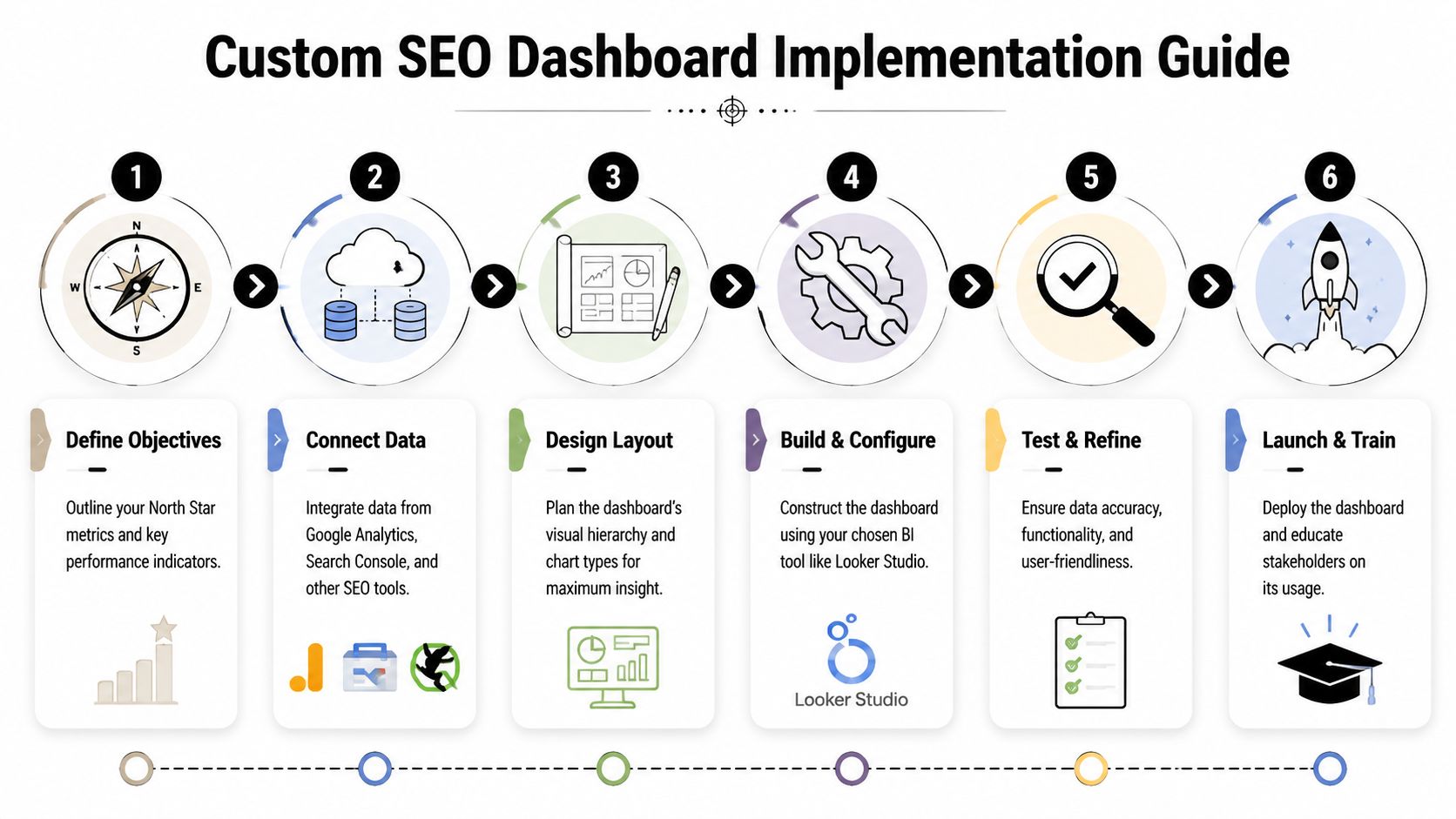
Implementation Guide for BI and Dashboard Tools
The build itself isn't complicated. The discipline is the hard part.
Looker Studio is still the most accessible option for many SEO teams because it connects easily with GSC and GA4, and it's usually fast to prototype. Power BI gives stronger modeling control when the business already works inside Microsoft. Tableau is often a better fit when analysts want more customization and tighter enterprise visualization standards.
Whatever tool you pick, the implementation path is mostly the same.
Use templates as a base, then customize hard
Starting from a blank canvas sounds clean, but it usually slows teams down. When building in Looker Studio, teams using blended data dashboards see 35% faster decision-making and a 22% higher SEO ROI. Success rates jump from 40% when building from scratch to 75% when using templates as a starting point, with top performers tracking 12-15 blended KPIs, according to Reporting Ninja's custom SEO dashboard benchmarks.
The key phrase there is starting point. A template gets you structure. It does not give you the right KPI definitions, business logic, segmentation, or AI search layer.
A practical implementation sequence looks like this:
Define the reporting entities
Decide what the dashboard will group by. Query clusters, landing-page groups, business lines, countries, device classes, and content types should be settled before you build visuals.Connect the core sources
Pull in GSC, GA4, and your backlink or rank-tracking source. Keep field names normalized where possible.Blend where the decision requires it
Join GSC page data with GA4 landing-page performance only where it clarifies action. Don't blend data just because you can.Create calculated fields carefully
Add fields for branded versus non-branded segments, CTR opportunity views, conversion efficiency by page group, or AI visibility summaries if your source supports them.Build audience-specific pages
One page for executives. Another for SEO practitioners. Another for content and technical teams if needed.Add controls and guardrails
Date range, country, device, brand segment, and page group filters are usually enough. More than that often creates confusion.
A broader evaluation of AI SEO software can also help teams think through which systems need to feed the dashboard versus which ones should stay as point solutions.
Blend data only where it sharpens action
Blending data is where many builds become fragile. Page paths don't always match. Date logic varies. Query data and session data don't line up perfectly. If you force a join where the underlying grain is incompatible, the dashboard looks unified but tells a distorted story.
Use blending for high-value questions:
- Which landing pages get strong search impressions but weak conversion outcomes?
- Which content clusters gain visibility but lose engagement?
- Which technically degraded sections also show business decline?
- Which AI prompts mention competitors but not your brand?
Leave exploratory analysis outside the main dashboard if the joins become too messy.
Add API-fed AI search data as a first-class source
This is the step that makes the dashboard future-proof.
The practical model is to treat AI search analytics like any other source with a defined schema. Pull in prompt-level visibility, sentiment, competitor comparison, and source attribution through an API or connector layer. Then map those records to the same business entities you use elsewhere, such as product category, solution line, market, or topic cluster.
That gives you a unified reporting flow:
| Build layer | Traditional SEO example | AI search example |
|---|---|---|
| Entity | Product pages | Product-related prompts |
| Performance metric | GSC clicks | LLM visibility rate |
| Quality metric | CTR or engagement | Sentiment or positioning |
| Attribution layer | Landing page or query | Cited sources or quoted references |
| Competitive lens | SERP overlap | Competitor mention share |
An AI search API becomes valuable in this context. Instead of checking a separate tool manually, the dashboard can show traditional organic performance next to AI visibility trends in one reporting environment. That operational win is significant.
For teams that want a high-level walkthrough before configuring their own build, this video gives a useful BI-oriented framing:
Testing before rollout
Don't launch the dashboard the day the charts look finished.
Check metric definitions against source tools. Validate date handling. Confirm that filters don't break executive views. Review whether every chart has an owner and a decision attached to it. Then run the dashboard in parallel with your current reporting for a short period so stakeholders can flag inconsistencies before it becomes the official source of truth.
The best dashboard builds aren't the most elaborate ones. They're the ones that survive contact with weekly reporting.
Activating Your Dashboard Governance and Growth
Most dashboards decay after launch. Not because the strategy was wrong, but because nobody owns the governance.
A custom seo dashboard needs operating rules. Without them, refresh issues creep in, definitions drift, and stakeholders stop trusting what they see.

Tie governance to business outcomes
The strongest governance model starts with a revenue ladder. Top-performing teams link technical SEO to revenue by creating a KPI ladder from crawl efficiency to conversions. By using dashboards to implement drill-throughs and prioritize fixes based on revenue proximity, they achieve 20-30% engagement lifts and target 10-15% YoY organic revenue growth, according to Siteimprove's guide to technical SEO and engagement dashboards.
That only works when definitions stay stable. A conversion has to mean the same thing every month. A critical error threshold has to be documented. An AI visibility metric has to use a consistent prompt set and classification method.
Set rules before exceptions pile up
A simple governance checklist beats a complex governance policy nobody reads.
- Document KPI definitions so teams know exactly how each metric is calculated and where it comes from.
- Assign owners for source quality, dashboard logic, and business interpretation.
- Schedule validation reviews to compare dashboard values against source tools.
- Control access and editing so stakeholders can explore data without breaking the reporting layer.
- Version major changes when you alter filters, schemas, or KPI formulas.
If your organization needs a stronger operating model around ownership and controls, these data governance insights for CIOs offer a useful management lens.
Governance isn't bureaucracy. It's what keeps the dashboard credible after the builder leaves the meeting.
Use alerts and feedback loops
The dashboard shouldn't only describe the past. It should flag risk.
Set alerts for material shifts in the metrics that matter to the business. That may mean sudden indexing problems, major landing-page conversion drops, brand sentiment changes in AI search, or competitor gains on strategic topics. Keep alerts sparse. If everything triggers a notification, the team will ignore all of them.
Then create a lightweight feedback loop:
| Review cadence | What to check |
|---|---|
| Weekly | Anomalies, broken filters, top action items |
| Monthly | KPI relevance, stakeholder usage, source consistency |
| Quarterly | Layout redesign, archived metrics, new business questions |
Tailor views without fragmenting the truth
Different teams need different cuts of the same data. B2B marketing may care about lead velocity and solution-page visibility. Brand and PR may care more about source attribution and sentiment in AI answers. Technical SEO may need issue segmentation by template or directory.
That doesn't mean each team should get its own isolated report.
The smarter move is one governed dataset with role-specific views. Same definitions. Different lenses. That structure keeps the organization aligned while still making the dashboard useful for daily work.
The dashboard grows when it stays trusted. It stays trusted when the team treats it like a product, not a one-time deliverable.
The Future of SEO Reporting Is Unified
The old version of SEO reporting treated Google as the whole playing field. That version is outdated.
A modern custom seo dashboard has to unify classic organic search, technical health, on-site outcomes, and AI search presence in one reporting system. Otherwise, the team ends up making decisions from partial visibility. They may improve rankings while losing share in AI answers. They may increase traffic while missing weak brand framing in model-generated results. They may publish more content without understanding which external sources shape how AI systems describe them.
The teams pulling ahead aren't just tracking more. They're tracking the right surfaces together.
Unified reporting creates better prioritization. It helps SEO, content, PR, analytics, and leadership work from the same operating view. And it turns SEO reporting from a backward-looking summary into a forward-looking decision tool.
If your team needs a clearer view of how AI systems present your brand, promptposition helps you track visibility, sentiment, positioning, competitor presence, and cited sources across leading LLMs. It's a practical way to add AI search intelligence to the reporting stack you already use, so your dashboard reflects the full search environment instead of only the traditional part of it.